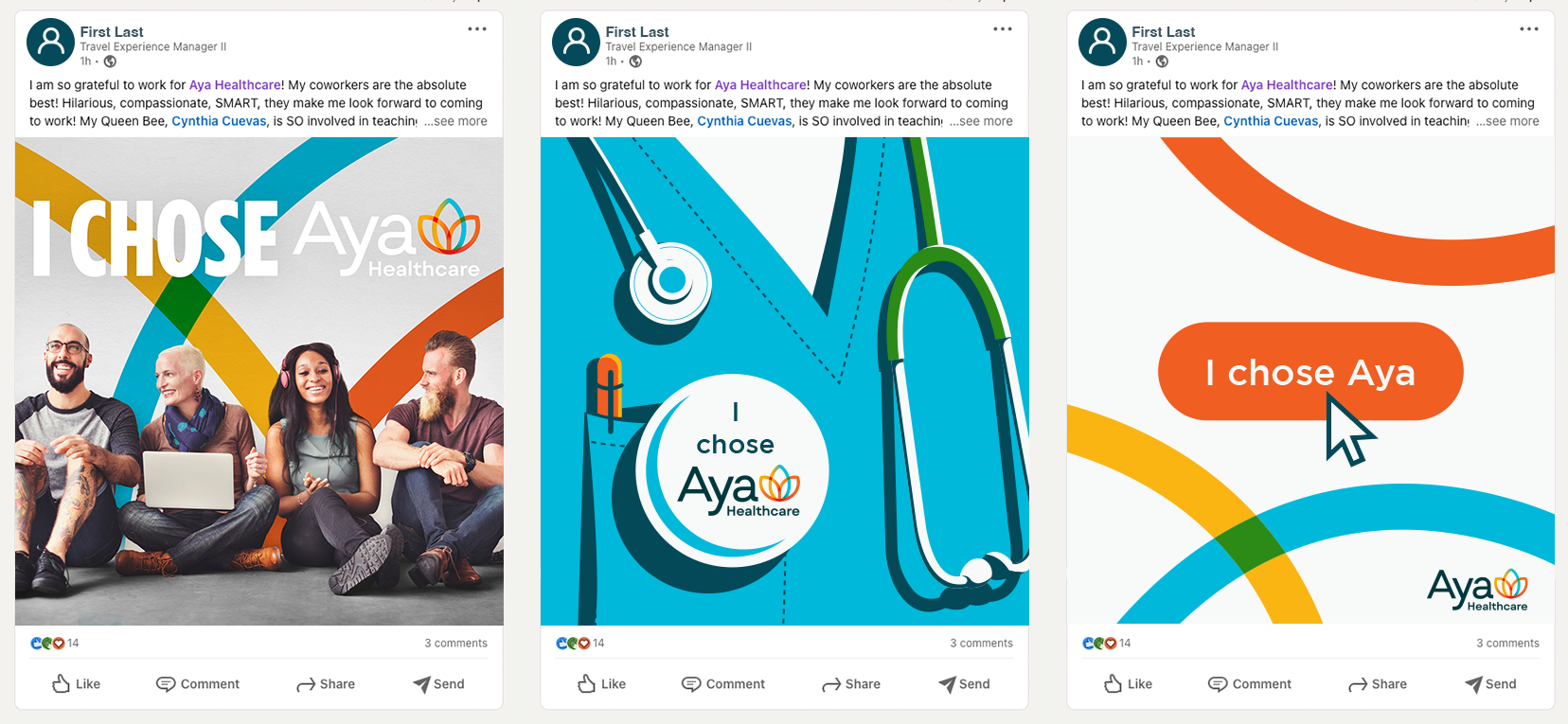
Aya Healthcare rebrand
Aya Healthcare was in need of a updated aesthetic to coincide with their massive success in the last couple years. Being such a large company they wanted to look the part and find a look that made them evolve. We worked on every single part of the brand and how we could make it look cohesive no matter where you interact with Aya.

We started with one of the most important parts of the brand; the logo. In the past they had been mentioned as A.Y.A Healthcare instead of Aya Healthcare. Given that information we decided it was a good idea to make the capital “A” and lower case “ya” a necessity. Strong and intense colors with overlapping parts brought out a youthful look that also had a tech look. Overall, we wanted to keep the lotus and find an interesting way to represent it.


After working through the brand guidelines and finding an aesthetic that matched our new logo we ran full steam ahead into collateral. The items below show a variety of looks that were created using the brand guidelines. Some fun illustrations and punchy colors made these pieces really stand out. We also did an entire web rebrand, starting with the framework of the original we went through and cleaned things up and found way to make the website process as easy as possible.


At Aya Healthcare we have an intranet that is used company wide. There are different sections you can click into and find different areas that help benefit your life. We needed some fun illustrations to accompany these sections. What you see below are a small cross section of those illustrations.


check out the whole site
ayahealthcare.com


