zero waste family branding
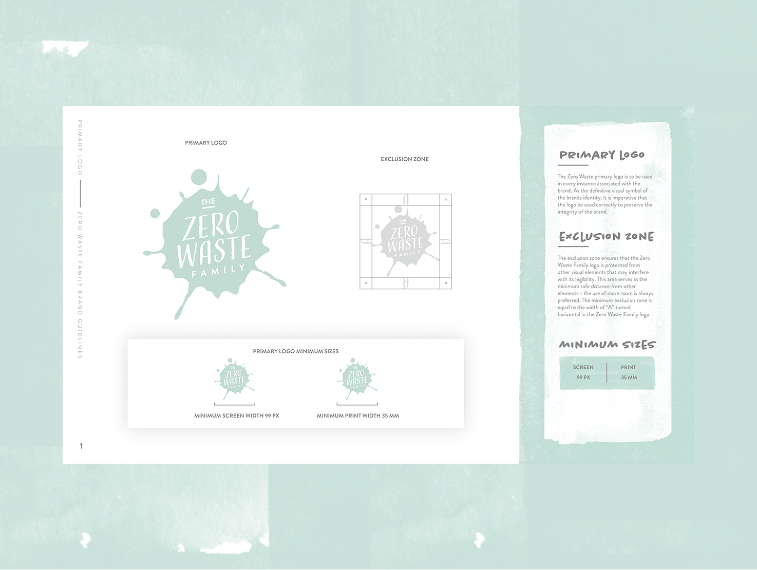
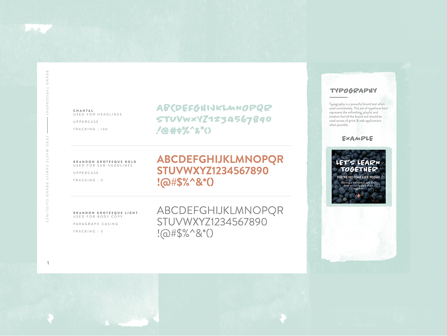
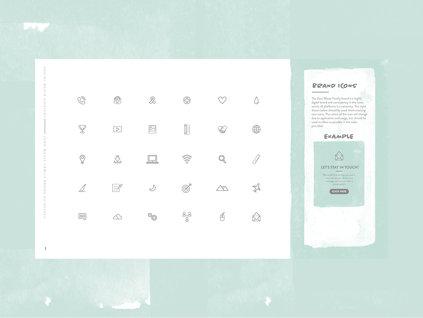
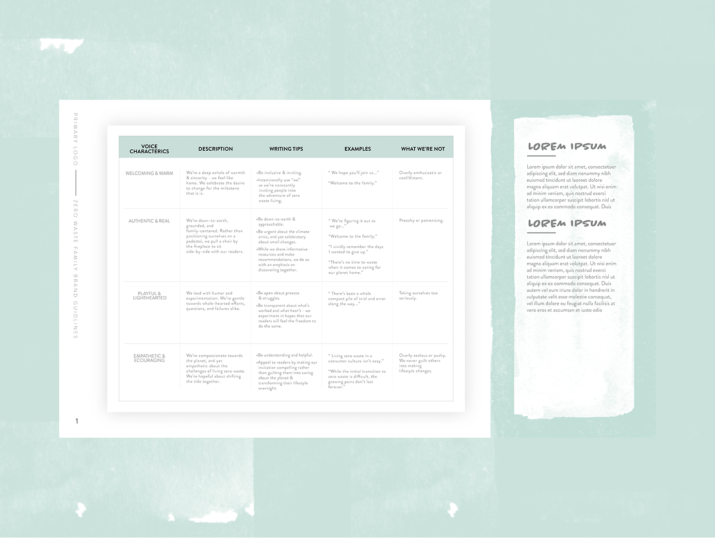
I was approached and asked to create a brand guide and logo for the Zero Waste Family. I hadn’t taken a step into the sustainable lifestyle and what that looks like from a stylistic point of view. I worked with the Zero Waste Family to figure out what they were looking for specifically, and started to round out a general idea to build their brand.

We started by creating a logo inspiration moodboard I could use and that they felt fit the persona of their brand. I then took that inspiration to the drawing board and started creating rough concepts of potential logos for their brand.


Once we finalized the logo direction and had a vectorized version created I dove into the aesthetics of the brand. We decided to create a brand that looks like it had been lived in a little bit. We felt this spoke to the sustainability and the lifestyle of reduce, reuse and recycle.








After creating all the brand assets necessary, The Zero Wasted Family asked if there was any way that we could create a Movie Title image for their upcoming film release that would live at the beginning of their movie. We met up and discussed the ideas that were swimming around and I went and started to sketch some idea of what i thought resembled the ideas they had in their mind. This was a really fun exercise and gave me an opportunity to dive in to a different digital illustration style.


finalized piece above


